My Favorite Plot
my-favorite-plot.Rmd
library(mrvplot)
library(ggplot2)
library(dplyr)
#>
#> Attaching package: 'dplyr'
#> The following objects are masked from 'package:stats':
#>
#>     filter, lag
#> The following objects are masked from 'package:base':
#>
#>     intersect, setdiff, setequal, union
library(ggpubr)
My Favorite Plot
In genomics we are almost always plotting a large number of data points, and often looking for correlations between two variables. This vignette showcases my favorite plot, which is a hexagonal binned scatter plot that evolves from individual points to an accurate representation of data density.
Generate Random Data
Let’s start by creating a lot random data points near the x=y line:
set.seed(42) # For reproducibility
n <- 2e5

# Generate data points near the x=y line with some scatter
x <- runif(n, -1, 1)
y <- x + rnorm(n, mean = 0, sd = 0.2) # y follows x with some noise

# Constrain y values to be between -1 and 1
y <- pmax(-1, pmin(1, y))

# Create the dataset
data <- data.frame(x = x, y = y)

# Show first few points
head(data)
#>            x          y
#> 1  0.8296121  0.7467050
#> 2  0.8741508  0.8726957
#> 3 -0.4277209 -0.7905166
#> 4  0.6608953  0.4978825
#> 5  0.2834910  0.2178231
#> 6  0.0381919  0.1721512
Step 1: Individual Points
Let’s start with a basic scatter plot showing all individual points:
step1 <- ggplot(data, aes(x, y)) +
  geom_point(alpha = 0.3, size = 0.5) +
  labs(
    title = "Step 1: Individual Points",
    subtitle = paste(n, "points near the x=y line")
  )

print(step1)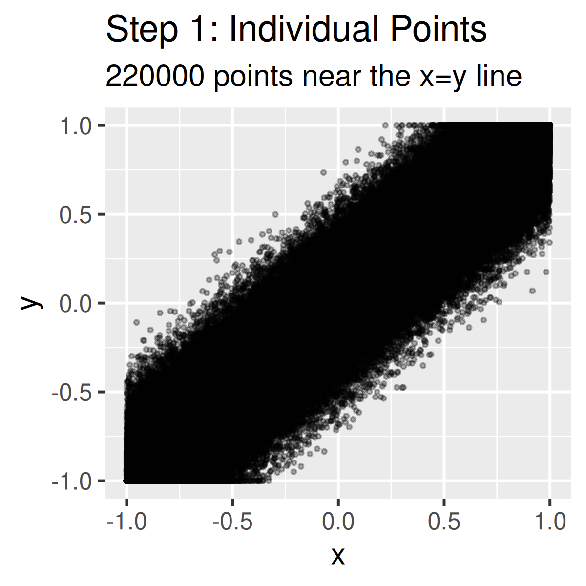
I rarely even start plots at this point anymore, it is almost always useful to apply just a little styling so you can come back and use it later for a presentation, poster, or publication.
Step 2: Add Grid Theme
My default theme is mrv_grid() for clean styling that
has worked for me in a variety of settings. No one likes the ggplot gray
background and it never works well for presentations or
publications:
step2 <- ggplot(data, aes(x, y)) +
  geom_point(alpha = 0.3, size = 0.5) +
  labs(
    title = "Step 2: Add Grid Theme",
    subtitle = "Clean styling with mrv_grid()"
  ) +
  mrv_grid()

print(step2)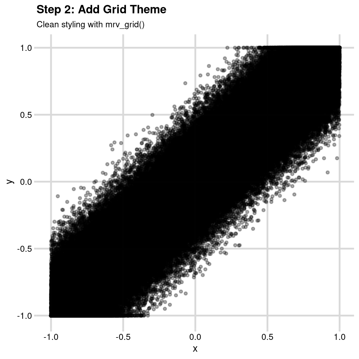
Step 3: Custom Axis Scales
It really is important to add proper axis labels and formatting. This
is very easy with the scales package, and
scale_{x,y}_continuous.
step3 <- ggplot(data, aes(x, y)) +
  geom_point(alpha = 0.3, size = 0.5) +
  scale_x_continuous(
    "Haplotype difference in accessibility (BL)",
    limits = c(-1, 1),
    labels = scales::percent
  ) +
  scale_y_continuous("Haplotype difference in accessibility (T)",
    limits = c(-1, 1), labels = scales::percent
  ) +
  labs(
    title = "Step 3: Custom Axis Scales",
    subtitle = "Proper axis labels with percentage formatting"
  ) +
  mrv_grid()

print(step3)
Step 4: Fixed Aspect Ratio and Reference Line
Add coord_fixed() and the reference line to show the x=y
relationship properly. Finally, I like using the ggpubr
function stat_cor() to add the correlation coefficient to
the plot:
step4 <- ggplot(data, aes(x, y)) +
  geom_point(alpha = 0.3, size = 0.5) +
  geom_abline(intercept = 0, slope = 1, color = "darkred", linetype = "dashed", size = 1) +
  coord_fixed() +
  stat_cor(size = 2) +
  scale_x_continuous("Haplotype difference in accessibility (BL)",
    limits = c(-1, 1), labels = scales::percent
  ) +
  scale_y_continuous("Haplotype difference in accessibility (T)",
    limits = c(-1, 1), labels = scales::percent
  ) +
  labs(
    title = "Step 4: Fixed Aspect Ratio and Reference Line",
    subtitle = "coord_fixed() and red dashed line show the x=y relationship"
  ) +
  mrv_grid()
#> Warning: Using `size` aesthetic for lines was deprecated in ggplot2 3.4.0.
#> ℹ Please use `linewidth` instead.
#> This warning is displayed once every 8 hours.
#> Call `lifecycle::last_lifecycle_warnings()` to see where this warning was
#> generated.

print(step4)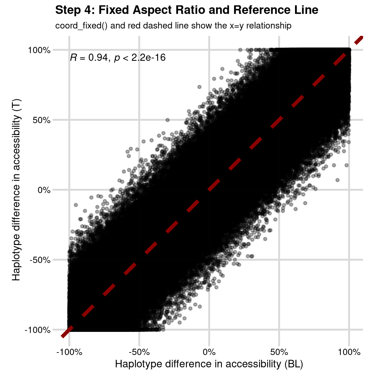
Step 5: Hexagonal Binning
Replace individual points with hexagonal bins to handle over-plotting:
step5 <- ggplot(data, aes(x, y)) +
  geom_hex(bins = 50) +
  geom_abline(intercept = 0, slope = 1, color = "darkred", linetype = "dashed", size = 1) +
  coord_fixed() +
  stat_cor(size = 2) +
  scale_x_continuous("Haplotype difference in accessibility (BL)",
    limits = c(-1, 1), labels = scales::percent
  ) +
  scale_y_continuous("Haplotype difference in accessibility (T)",
    limits = c(-1, 1), labels = scales::percent
  ) +
  labs(
    title = "Step 5: Hexagonal Binning",
    subtitle = "Hexagonal bins show data density patterns"
  ) +
  mrv_grid() +
  theme(legend.position = "right")

print(step5)
#> Warning: Removed 47 rows containing missing values or values outside the scale range
#> (`geom_hex()`).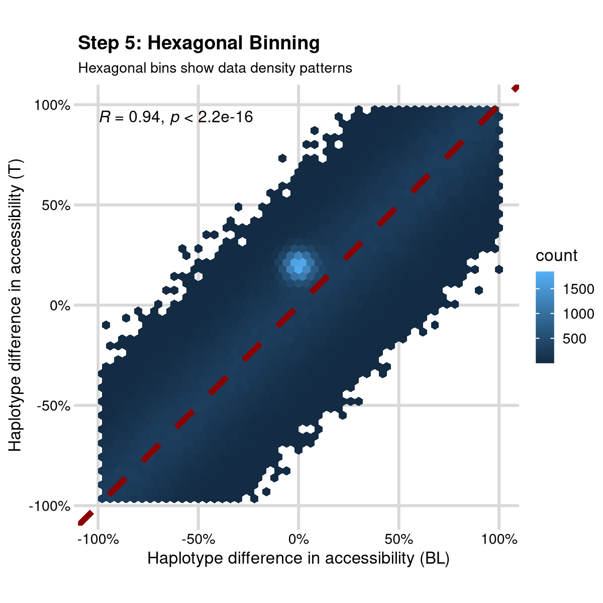
Do you see it? I added a secret cluster of points that is only visible in the hexagonal bins. This is a great way to show how many data points can hard structure that is important.
Added bonus, this is now easy to open in Adobe Illustrator or Inkscape because it doesn’t have a million individual points, just a few hexagonal bins.
Step 6: Final - Custom Color Palette
The whole point of hexbin is that you have lots of data points, and this often means a log scale for color is much more appropriate. Adding this log scale and a nice color scheme gets you to “my favorite plot”. At least for now!
favorite_plot <- ggplot(data, aes(x, y)) +
  geom_hex(bins = 50) +
  scale_fill_distiller("", palette = "Spectral", trans = "log10") +
  geom_abline(intercept = 0, slope = 1, color = "darkred", linetype = "dashed", size = 1) +
  coord_fixed() +
  stat_cor(size = 2) +
  scale_x_continuous("Haplotype difference in accessibility (BL)",
    limits = c(-1, 1), labels = scales::percent
  ) +
  scale_y_continuous("Haplotype difference in accessibility (T)",
    limits = c(-1, 1), labels = scales::percent
  ) +
  labs(
    title = "My Favorite Plot: Spectral Color Palette",
    subtitle = paste("Hexbin points with log-transformed colors")
  ) +
  mrv_grid() +
  theme(legend.position = "right")

print(favorite_plot)
#> Warning: Removed 47 rows containing missing values or values outside the scale range
#> (`geom_hex()`).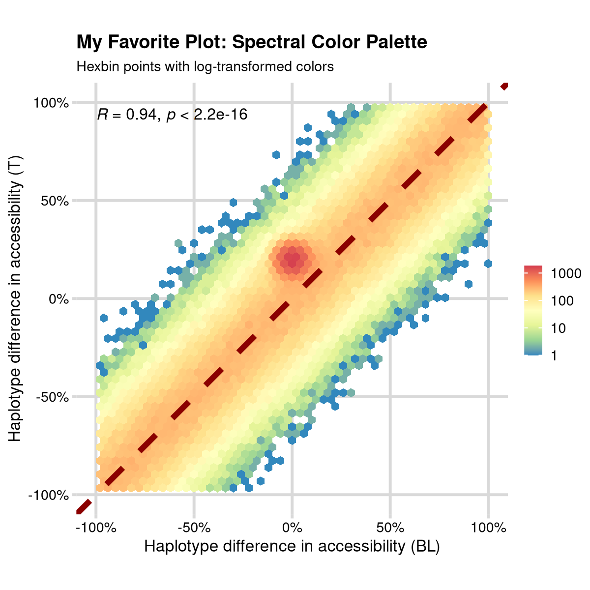
Saving the results
Saving the exact data that went into a plot is always important,
often useful, and rarely done. The mrv_ggsave() function
allows you to save the plot and also export the data used in the plot to
a “Tables/” directory. This has become particularly useful for recent
requirements in some journals that every data panel be accompanied by an
excel file with the data used to create it.
mrv_ggsave also always saves a copy of the plot to
“tmp.{ext}” where {ext} is the file extension you specify. This is
useful because you can open up one file and as you run or rerun code you
will see all the figure updates. I use this when working with R remotely
on vscode instead of Rstudio.
Finally, when you save figures, save them with a width and height of about 3 inches. This is around the size of a journal figure panel, and it is easy to scale up or down from there. If you don’t like the look, try adjusting the size of the font, before you change the size of the figure.
# Save the favorite plot with data export
mrv_ggsave("Figures/my_favorite_plot.pdf", width = 3, height = 3)